Overview
Click and navigate the overview documentation by clicking on the topics below or on the left. You can learn what Whatevr is all about by reading the overview Get Started page.
Component Overview:
Welcome to the component overview page. In this section, we'll provide you with an in-depth understanding of the core building blocks that power our platform. Each component plays a pivotal role in delivering a seamless user experience and delivering the apps functionality.
User Interface (UI) Components: The user interface is the face of our app. It encompasses various elements such as buttons, forms, navigation bars, and visual representations of data. The platform boasts a consistent, intuitive and modern UI design, optimised for ease of use and accessibility across multiple devices.
App Framework The platform framework is a structured and reusable foundation that simplifies and speeds up app development. It provides pre-built components, tools, and guidelines, enabling users to understand our feature-rich apps and tools.
By understanding each of these components, you'll gain valuable insights into how the platform operates. This component overview page serves as a foundation for your exploration of our cutting-edge app. Happy exploring!
Our framework is consistent throughout the platform, with the same UX and UI layout and features. This means that learning new apps/tools within our platform is quick, simple, and easy. The core framework elements will be covered on this documentation page.
AI
The AI Input offers Quick Options right at your fingertips. These are pre-suggested actions you can take or a free write your needs and wonts and let AI create.
Learn MorePrompt on space ...
App Store
The "Add new" button is located at the bottom right of the platform and allows you to add new apps and tools to your workspace.
Learn MoreFlow
Our flows offer a wide range of tools and functionalities designed to suit different professional needs. Whether you're managing a business plan, optimizing your marketing funnel, or creating a content marketing strategy, flows provide the structure and flexibility to support your work.
Explore ViewsFlow Name
DescriptionFramework Cards
A Framework Card represents a pre-built framework designed to integrate seamlessly into your workspace. These frameworks are tailored to specific use cases and provide a foundation for organizing and managing your work.
Framework Cards empower you to enhance your space with purpose-built tools and structures, making it easier to streamline flows, collaborate with your team, and achieve your goals.
Framework
Type
App Templates
An app card is designed to display information about the type of content you are creating. It typically consists of a container with distinct content, such as text, images, or icons, presenting bite-sized details about app data or groups of app data for different uses cases inside of Whatevr.
App Name
App description
App Content
The content item card provides an intuitive and streamlined approach to managing content. It offers quick access to essential information, editing options, and advanced settings, making it a valuable tool to organise and manage your content more efficiently.
Learn Moretype
Data
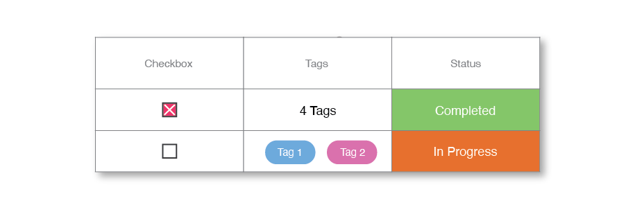
A "data type" defines the kind of functionality you can add to your app, making it possible to organize and work with specific types of data, such as tasks, web links, funnel metrics, and more. With hundreds of data types available, you can create tailored App solutions that meet your unique needs.
Explore ViewsData Name
Data DescriptionViews
Views are a way to add data and functionality to an apps base use. This gives you a more customisable experience. Depending on the app, you might get different views of the data or different tools and features.
Explore Views
View Name
View descriptionModules
A module is a fundamental building block of most apps. It is a self-contained unit of functionality that can be used to build and customize different parts of the app.
Learn MoreModule Name
Module description
Center
The centre is what provides you with notifications and your schedule/todo list. The centre can be found at the top right of the application at all times other than inside of apps and tools.
Learn MoreBottom sheet
Bottom sheets provides a simple way to display all information on a piece of content, asset, workspaces and other elements within the platform. Bottom sheets are designed to provide as much information as possible while maintaining control, quick access, and utility.
Learn MorePrj
My Project
Tags
Info
Calendar
Info
Chat
Info
Account
Account bottom sheets are used to provide a simple way to display all the information on a user within the platform. They are built to provide as much information as possible, but still manage to deliver control, quick access and utility.
Learn MoreJoe Bloggs
Creative Designer & Marketer
Connection's
Follower's
Tab 1
Tab 2
Tab 3