Apps
The content item card provides an intuitive and streamlined approach to managing content. It offers quick access to essential information, editing options, and advanced settings, making it a valuable tool to organise and manage your content more efficiently.
The content item card provides an intuitive and streamlined approach to managing content. It offers quick access to essential information, editing options, and advanced settings, making it a valuable tool to organise and manage your content more efficiently.
App Content Card
The content item card provides an intuitive and streamlined approach to managing content. It offers quick access to essential information, editing options, and advanced settings, making it a valuable tool to organise and manage your content more efficiently.
Learn Moretype
App Sheet
Bottom sheets provides a simple way to display all information on a piece of content, asset, workspaces and other elements within the platform. Bottom sheets are designed to provide as much information as possible while maintaining control, quick access, and utility.
Prj
My Project
Tags
Info
Calendar
Info
Chat
Info
Bottom sheets provides a simple way to display all information on a piece of content, asset, workspaces and other elements within the platform. Bottom sheets are designed to provide as much information as possible while maintaining control, quick access, and utility.
App UI
When editing any content within Whatevr, you will open an app framework.
App
Our apps use the same framework, with the same UX & UI layout. This makes learning new apps within Whatevr quick, simple and easy. The core framework elements will be covered on this documentation page.
This is only a high-level overview. Please see the relevant app documentation above for more information on a specific app builder and framework.
Left Nav
Apps have left panels with extra controls and tabs within its framework. This is how you add app content data to your app and extra settings per data type.
Prj
Name here
Type
Tasks
Task one
Task Two
Canvas
Canvas one
Canvas Two
SVG
SVG canvas one
SVG canvas two
Map
Map one
LLM
LLM chat one
Data
A "data type" defines the kind of functionality you can add to your app, making it possible to organize and work with specific types of data, such as tasks, web links, funnel metrics, and more. With hundreds of data types available, you can create tailored App solutions that meet your unique needs.
A "data type" defines the kind of functionality you can add to your app, making it possible to organize and work with specific types of data, such as tasks, web links, funnel metrics, and more. With hundreds of data types available, you can create tailored App solutions that meet your unique needs.
Explore ViewsData Name
Data DescriptionTop Nav
Views are a way to change then way you view a Data type. This gives you a more customisable experience. Depending on the app, you might get different views of the data or different tools and features.
Sub Data
Views
Views are a way to change then way you view a Data type. This gives you a more customisable experience. Depending on the app, you might get different views of the data or different tools and features.
Views are a way to add data and functionality to an apps base use. This gives you a more customisable experience. Depending on the app, you might get different views of the data or different tools and features.
Explore Views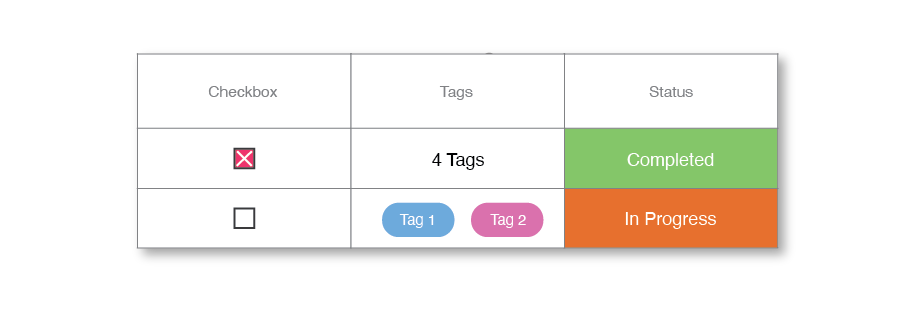
View Name
View descriptionAdhoc View
Adhoc views are available in most apps, and make it easy to view any attachments to the content such as tasks, files, or chats.