Cards
Cards are used throughout the platform to represent content, views, apps and tools. They are consistant and will become recognisable so you are easily able to identity different types of content within the platform.
They contain brief information, give access to bottom sheets, and enable quick utlities such as sharing, duplicating, deleting and editing.
Content Card List
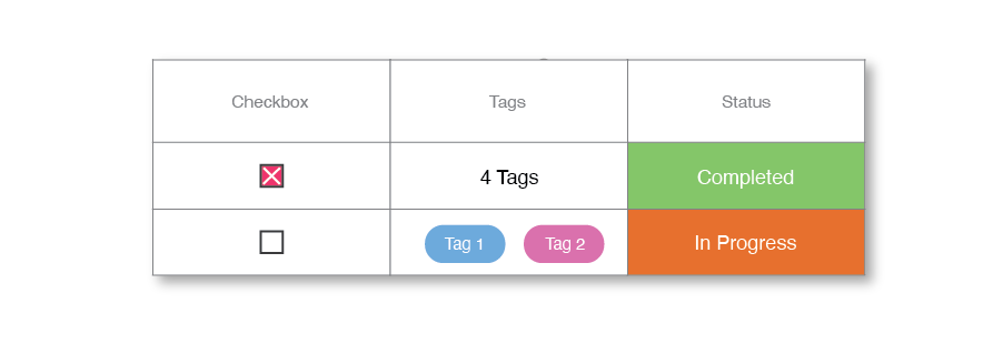
The content list item card provides an intuitive and streamlined approach to managing content. It offers quick access to essential information, editing options, and advanced settings, making it a valuable tool to organise and manage your content more efficiently.
Prj
Name here
Type
When a user clicks on a content list item card, a bottom sheet appears that provides a more detailed view of the content. This overview includes essential information such as the title, author, date, and a brief description of the content.
Content Card Grid
Content lists can be viewed in grid mode for a larger preview of content.
type
Sub Content Card
Within apps that have sub content (for example, sub projects), these pieces of sub content are represented by sub content cards, and have similar functionality to content cards. They also allow you to select sub content to view within the app. Some apps let you view more than one sub content at a time, for example projects will let you view multiple sub projects one after another.
Sub Project 1
Sub Project 2
Modules
The module card is shown when adding modules to content within an app, and gives an overview of the modules functionality and purpose. Clicking on the module (not the add button) will bring up a detailed overview of the module.
Module Name
Module description
Data
A "data type" defines the kind of functionality you can add to your app, making it possible to organize and work with specific types of data, such as tasks, web links, funnel metrics, and more. With hundreds of data types available, you can create tailored App solutions that meet your unique needs.
Tasks
Data DescriptionViews
A view card is shown when adding views to an app. It lets you view data in different ways. Clicking on the view (not the add button) will bring up a detailed overview of the view.
List
Your Progress in a glance.Template Cards
An Template app card is shown when adding apps to your workspace in the store. It provides an overview of the app. Clicking on the card (not the add button) will bring up a more detailed overview.
Projects
Your Progress in a glance.